
Products by Category
-
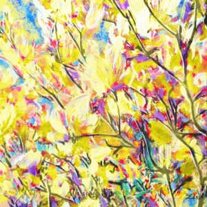
Before the Fall | Magnolia Blossoms – Edition in Yellow
Price range: $19.00 through $899.00 -
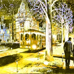
Gilded Night | Biltmore at Night – Edition in Yellow
Price range: $19.00 through $899.00 -
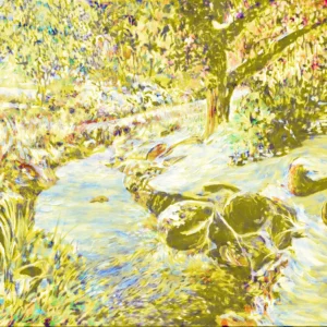
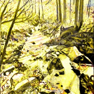
Winter Passing | Snowy Creek – Edition in Yellow
Price range: $19.00 through $899.00 -
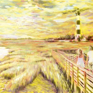
Bound to the Light | Bodie Island Lighthouse – Edition in Yellow
Price range: $19.00 through $899.00 -
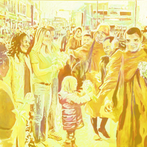
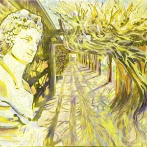
The Work of Peace | Monks’ Peace Walk- Edition in Yellow
Price range: $19.00 through $899.00 -
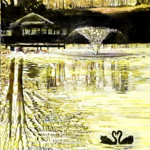
The Shape of Devotion | Pair of Black Swans at Liberty Acres – Edition in Yellow
Price range: $19.00 through $899.00 -
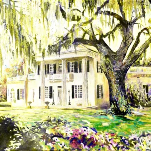
Columns in Time | Orton Plantation – Edition in Yellow
Price range: $19.00 through $899.00 -
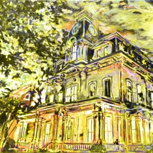
The Weight of Time | Heck-Andrews House – Edition in Yellow
Price range: $19.00 through $899.00 -
Fields of Light | Quail Roost – Edition in Yellow
Price range: $19.00 through $899.00 -
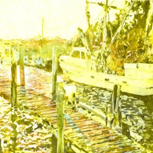
Memories of Salt and Time | Marshallberg Fishing Boats – Edition in Yellow
Price range: $19.00 through $899.00 -
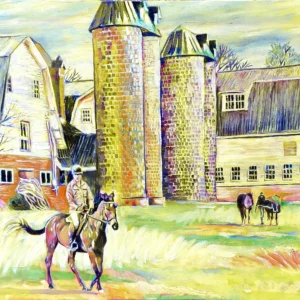
What Horses Know | Secret at the Stable – Edition in Yellow
Price range: $19.00 through $899.00 -
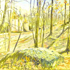
Towers of Light and Time | Castle Mont Rouge – Edition in Yellow
Price range: $19.00 through $899.00 -
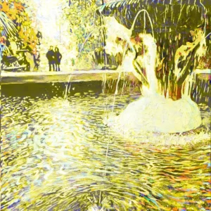
Light in Circulation | Fountain Reflections – Edition in Yellow
Price range: $19.00 through $899.00 -
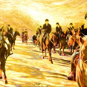
Unbridled Light | Red Mountain Hounds – Edition in Yellow
Price range: $19.00 through $899.00 -
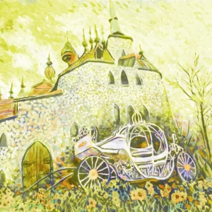
Waiting for Chloe | Chloe’s Carriage – Edition in Yellow
Price range: $19.00 through $899.00 -
Season’s End | Canoe Racks at Sunset Lake – Edition in Yellow
Price range: $19.00 through $899.00 -
Dapppled Witness | Trellis at Biltmore – Edition in Yellow
Price range: $19.00 through $899.00 -
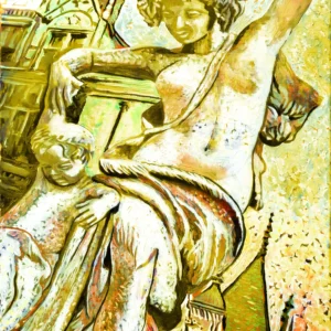
Marble Remembering Breath | Dancing Lesson at Biltmore – Edition in Yellow
Price range: $19.00 through $899.00 -
Whispers of the Creek | Creek at Leasburg – Edition in Yellow
Price range: $19.00 through $899.00 -
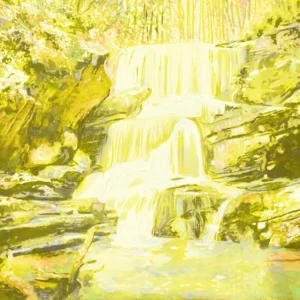
Water Breaking into Light | Little Bradley Falls – Edition in Yellow
Price range: $19.00 through $899.00 -
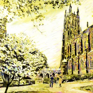
The Architecture of Light | Duke Chapel – Edition in Yellow
Price range: $19.00 through $899.00 -
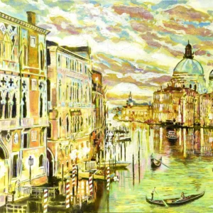
The Long Memory of Water | Grand Canal in Venice – Edition in Yellow
Price range: $19.00 through $899.00 -
Love Before Words | Zora at Liberty Acres – Edition in Yellow
Price range: $19.00 through $899.00 -
The Roar of Light | Occoneechee Speedway – Edition in Yellow
Price range: $19.00 through $899.00 -
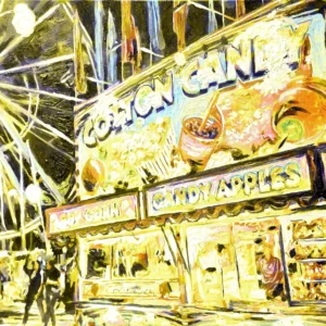
The Scent of Memory | Traveling Carnival – Edition in Yellow
Price range: $19.00 through $899.00 -
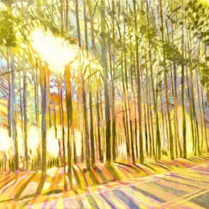
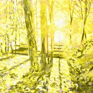
The Velocity of Light | Duke Forest – Edition in Yellow
Price range: $19.00 through $899.00 -
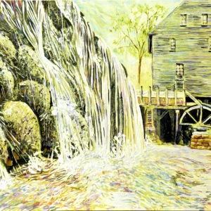
Working Memory | Yates Mill – Edition in Yellow
Price range: $19.00 through $899.00 -
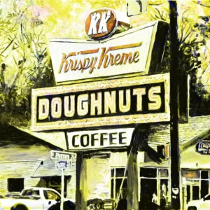
Familiar Glow | Krispy Kreme – Edition in Yellow
Price range: $19.00 through $899.00 -
The Path Taken | The Road to Castle Mont Rouge – Edition in Yellow
Price range: $19.00 through $899.00 -
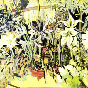
Grace Under Glass | Conservatory at Biltmore – Edition in Yellow
Price range: $19.00 through $899.00 -
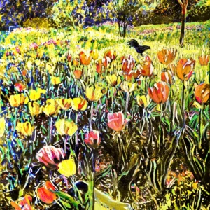
The Madness of Bloom | Tulips at Firefly Farm – Edition in Yellow
Price range: $19.00 through $899.00 -
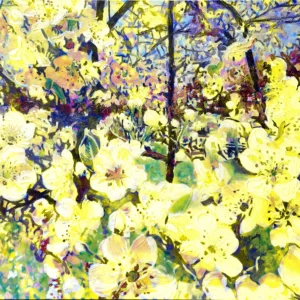
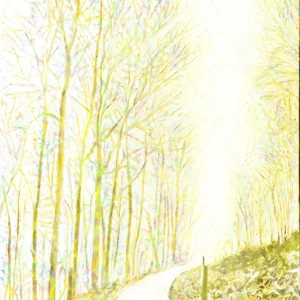
Suddenly Spring | Bradford Pear Blossoms – Edition in Yellow
Price range: $19.00 through $899.00
Ode to Yellow: The Color of Light, Life, and Laughter
Yellow is not simply a color — it is light itself, caught in motion. It is the first color the eye notices and often the last emotion to leave a room. Yellow laughs. Yellow wakes us up. It carries the energy of the sun and the optimism of a new day, vibrating with life-force and warmth. In painting, yellow is both fragile and powerful: too little and the world dulls, too much and it blazes. When balanced, it becomes joy made visible.
Historically, yellow has always belonged to life and vitality. From ancient sun worship to medieval halos, from golden wheat fields to glowing candlelight, yellow has marked what sustains us. It is the color of laughter, of friendship, of hope — and yet it also demands respect. Yellow cannot hide. It stands boldly in the open, declaring presence and possibility.
In my work as a North Carolina Luminous Impressionist, yellow is never an accent. It is a heartbeat. It pulses through fields, streets, skies, and memories, illuminating moments that feel alive and fleeting. Yellow reminds us that light is not static — it dances, flickers, and moves through time.
To paint yellow is to believe in joy, even when the world feels heavy. It is a declaration of optimism rooted in reality. Yellow is not naive; it has endured thousands of years of human history, joy, betrayal, holiness, and laughter. And still it shines. To love yellow is to choose light — again and again.
Sunlit Carolina: Yellow as the Language of Southern Light
Southern light speaks differently, and in North Carolina it speaks fluently in yellow. The sun here does not merely illuminate; it wraps, warms, and saturates. Morning light slips across fields in pale lemon tones, while midday sun turns roads, barns, and beaches into glowing planes of gold. By late afternoon, everything feels dipped in honey.
This is a land where yellow is not decorative — it is structural. It defines how buildings age, how trees glow, how skin tones warm, and how memory settles into place. From coastal marsh grasses to Piedmont farmland, yellow becomes the connective tissue between earth and sky. It is the color of heat rising from pavement, of dust drifting in country air, of clapboard houses slowly bleaching under decades of sun.
As a painter, I do not invent this yellow — I observe it. North Carolina teaches yellow generously, especially to those willing to slow down. It lives in the way sunlight catches Spanish moss, turns old brick buttery, and softens the edges of towns and trails. This yellow carries emotion: comfort, nostalgia, endurance.
Southern yellow is forgiving. It allows shadows to remain soft and forms to breathe. It transforms ordinary scenes into moments of radiance. To paint North Carolina without yellow would be to remove its accent, its rhythm, its voice. Yellow is how this place speaks light — warmly, openly, and with unmistakable soul.
Before Yellow Was Paint: Ochre, Caves, and the First Artists
Long before yellow had a name, it had a purpose. It was earth, clay, and survival — scraped from the ground and mixed with intention. Yellow ochre, one of humanity’s oldest pigments, connects us directly to the first artists who ever made marks with meaning. In caves like Lascaux, yellow horses gallop across stone walls, their forms alive with motion and belief. These were not decorations; they were rituals, stories, and declarations of existence.
Ochre’s endurance is astonishing. Seventeen thousand years later, it still glows. The same iron-rich clay used by prehistoric artists became a cornerstone of ancient Egyptian tomb paintings, Roman murals, medieval manuscripts, and Renaissance underpaintings. Yellow was never fleeting. It was foundational.
There is something profoundly honest about painting with earth. Yellow ochre does not pretend to be light; it remembers being soil. It carries warmth without glare, substance without heaviness. For painters, it has always been a trusted companion — a way to build light from the ground up.
In my work, yellow ochre feels ancestral. It grounds luminous color in something older than style or trend. When I use it, I feel connected not only to art history but to humanity itself — to hands pressing pigment into stone, walls, and memory. Yellow began as earth, and in many ways, it never left.
Golden Hour: The Sacred Time When Everything Turns Yellow
There is a moment each day when the world exhales and everything turns gold. This is golden hour — a brief, sacred window when light becomes emotional. Shadows lengthen, colors soften, and yellow drifts across the landscape like a blessing. In North Carolina, this moment feels almost ceremonial, especially in the mountains and along the coast.
Golden hour is not about brightness; it is about warmth. It transforms the ordinary into the unforgettable. Trees glow from within. Roads shimmer gently. Faces soften. Even time itself seems to slow. Painters have chased this light for centuries because it offers something rare: harmony.
This is the yellow of memory. The yellow we remember from childhood evenings, from long drives home, from the feeling that something beautiful is ending but will return. Impressionists understood this deeply. They painted fleeting light because it mirrored fleeting life.
In my paintings, golden hour is where emotion lives. It is the bridge between day and night, clarity and mystery. Yellow becomes tender here — not loud, not demanding — simply present. To paint golden hour is to paint gratitude. It reminds us that light does not need to last forever to be meaningful. Sometimes, its power comes precisely from how briefly it stays.
Yellow Ochre & Earth Pigments: Painting with the Land Itself
To paint with yellow ochre is to paint with the land. It is pigment stripped of vanity, rooted in geology and time. Earth pigments like ochre, sienna, and umber were never invented — they were discovered. Dug from hillsides and riverbanks, they carry the memory of place within them.
For centuries, artists relied on these pigments not only for their beauty but for their reliability. Yellow ochre dries well, ages gracefully, and harmonizes effortlessly with other colors. It has been the quiet architect behind countless masterpieces, supporting flesh tones, skies, fields, and light itself.
In North Carolina, this connection feels especially intimate. The red and yellow clays of the region echo the palettes painters have trusted for thousands of years. When I use earth-based yellows, I feel aligned with the landscape rather than imposed upon it. The color belongs.
Earth pigments teach patience. They do not shout. They glow steadily, honestly. They remind us that true luminosity often comes from restraint. Yellow ochre is the foundation upon which brighter yellows can sing — proof that light is strongest when grounded.
Painting with the land is an act of respect. It acknowledges history, place, and continuity. Yellow ochre is not just color; it is inheritance.
Divine Yellow: Gold, Halos, and the Color of the Sacred
Yellow becomes holy when it turns to gold. Across civilizations, gold has stood for the eternal — untarnished, imperishable, radiant. In sacred art, yellow was never casual; it was reserved for divinity, wisdom, and heavenly authority. Byzantine mosaics shimmered with gold leaf, flattening space so that saints existed outside time. Halos glowed yellow not to imitate sunlight, but to declare spiritual presence.
In medieval Europe, yellow carried paradox. It symbolized divine reason and sacred light, yet it was also assigned to betrayal. Judas wore yellow, while saints wore gold. This tension gave the color power — yellow could elevate or condemn. In the Roman Catholic tradition, yellow and white became the colors of the papacy, symbolizing the golden key to heaven and divine authority bestowed upon Saint Peter.
Gold is not pigment; it is material light. Renaissance painters layered it with reverence, applying it where the human met the divine. Later, Gustav Klimt resurrected gold not for theology, but for sensual transcendence — wrapping human intimacy in sacred radiance.
In North Carolina, divine yellow appears quietly: sunlight through church windows, dust glowing in sanctuary air, old wooden pews warmed by afternoon light. Yellow becomes sacred not by proclamation, but by presence. It reminds us that holiness often arrives softly — as light touching what we already love.
Sunflowers, Wheat Fields, and Van Gogh’s Yellow Fever
No artist loved yellow more openly than Vincent van Gogh. For him, yellow was salvation. Writing from Arles, he described sunlight as “bright sulfur yellow, pale lemon gold,” language that reads like devotion. His sunflowers are not still lifes — they are portraits of energy itself, blooming with urgency and heat.
Van Gogh lived inside yellow. Wheat fields burned beneath vast skies, vibrating with movement and emotion. He used chrome yellow and cadmium yellow straight from the tube, embracing their intensity at a time when most painters softened color. Yellow was not decoration; it was expression — a way to paint hope, loneliness, joy, and despair all at once.
In North Carolina, sunflowers and wheat carry a similar emotional weight. Fields glow under summer heat, heavy with promise and labor. Yellow becomes abundance made visible — not effortless, but earned. The work of the land echoes Van Gogh’s urgency: growth, harvest, decay, renewal.
Van Gogh’s yellow was not gentle. It was obsessive, radiant, dangerous, and deeply human. That intensity resonates in luminous painting today. Yellow, when pushed, reveals truth. It strips away politeness and demands feeling. To paint yellow boldly is to accept vulnerability — and to trust that light, even when overwhelming, is worth chasing.
Dangerous Beauty: Toxic Yellows, Arsenic, and Artistic Obsession
Yellow’s brilliance has always come at a price. Some of the most beautiful yellows in art history were also the most dangerous. Orpiment, an arsenic sulfide mineral, glowed with golden intensity and was prized from ancient Egypt to Renaissance Europe. It adorned tombs, manuscripts, and palaces — even as it poisoned those who handled it.
Painters often licked their brushes to achieve fine points, unknowingly ingesting toxins. Yellow became an obsession worth risking one’s health for. Later came uranium yellow, used in ceramics and glass, radioactive and luminous, a quiet menace disguised as beauty. Artists chased light without fully understanding the cost.
This history gives yellow a sharp edge. It reminds us that brilliance is rarely harmless. Yet artists persisted. They always do. Because yellow offers something irresistible: radiance that feels alive.
Today, safe pigments replace their deadly ancestors, but the legacy remains. Yellow carries intensity, volatility, and risk — emotionally if not physically. In painting, it must be handled with care. Too much, and it overwhelms. Too little, and the light disappears.
Yellow teaches respect. It rewards courage and punishes carelessness. That tension — between danger and beauty — is part of what makes yellow unforgettable.
Yellow & Reason: Enlightenment, Knowledge, and the Thinking Mind
Yellow is the color of thought illuminated. In medieval European symbolism, red stood for passion, blue for the spiritual, and yellow for reason. It became associated with intellect, learning, and clarity — the light of understanding breaking through darkness.
Universities adopted yellow gowns for faculties of science and research. In language, “bright” and “brilliant” became synonyms for intelligence. Yellow sharpened the mind. It encouraged focus, curiosity, and alertness.
During the Enlightenment, yellow aligned with rational inquiry and progress. Knowledge was light, and light was yellow. Even today, yellow stimulates concentration and memory. It awakens mental energy, making it ideal for spaces of learning and creation.
In art, yellow often anchors composition — guiding the eye, clarifying form. Impressionists used it to suggest atmosphere and structure simultaneously. It is both emotional and intellectual, warm yet precise.
In North Carolina, yellow reason appears in quiet ways: sunlight on open books, schoolhouses glowing in afternoon light, research campuses alive with curiosity. Yellow reminds us that thinking itself is a luminous act — one that requires warmth as much as rigor.
Southern Harvest: Cornfields, Hay, and the Yellow of Work
Yellow is the color of labor made visible. In the South, harvest transforms the landscape into a patchwork of gold. Cornfields ripple under the sun, hay bales glow like stored sunlight, and dust rises in warm clouds during long days of work.
This yellow is not decorative — it is earned. It carries sweat, endurance, and rhythm. It marks seasons and survival. Historically, yellow harvests fed families and shaped economies. Corn, maize, wheat — these colors are sustenance and continuity.
Painters have long understood harvest yellow as a symbol of both abundance and fragility. Fields glow briefly before being cut. The beauty is intense because it is temporary. This aligns deeply with Impressionism’s fascination with fleeting moments.
In North Carolina, harvest yellow feels personal. It lives in rural roads, barns, and open fields. It speaks of tradition, responsibility, and gratitude. This is yellow grounded in effort — warm, honest, and humble.
To paint harvest yellow is to honor work itself. It acknowledges the hands that shaped the land and the light that made growth possible. Yellow, here, is dignity.
Yellow Joy: Humor, Playfulness, and the Spirit of Optimism
Yellow laughs before it speaks. It is the color most closely tied to joy, humor, and spontaneous delight. Across cultures, yellow signals optimism — a visual smile that lifts the spirit almost instantly. Children gravitate toward it instinctively. It appears in toys, chalk, kites, and laughter itself.
Psychologically, yellow stimulates the brain, encouraging curiosity and lightheartedness. It reduces heaviness and invites play. In art, yellow often punctuates seriousness, breaking formality with warmth. Even in somber compositions, a touch of yellow offers relief — a reminder that life persists.
In North Carolina, yellow joy lives everywhere: roadside sunflowers turning their heads toward the sky, school buses glowing like moving exclamation points, laughter spilling from porches at dusk. It’s in county fairs, lemonade stands, and the sound of cicadas vibrating in summer heat.
For the Impressionist, yellow is essential. It animates brushwork and keeps paintings from collapsing into moodiness. It dances. It refuses to sulk. Used boldly, yellow becomes laughter translated into light.
Yellow joy doesn’t deny hardship; it counters it. It is resilience made visible — a way of saying that delight still belongs to us. In luminous painting, yellow joy is not childish. It is courageous.
The Yellow South: Porches, Peaches, and Sun-Washed Architecture
The South understands yellow intimately. It wears it on its buildings, its fruit, and its light. Southern architecture often embraces yellow — pale butter houses, sun-faded barns, porch ceilings warmed by decades of afternoon glow.
Yellow reflects heat while welcoming it. It cools and comforts simultaneously. Historically, yellow paint was practical, made from ochres and lime washes, but it also carried hospitality. A yellow house feels open. It invites conversation and lingering.
Peaches embody the South’s relationship with yellow — tender, fragrant, sun-fed. Their blushing gold carries sweetness and memory. Fruit stands, orchards, and backyards glow with this color during high summer.
In coastal towns and rural communities alike, yellow softens architecture. It absorbs sunlight and gives it back gently. Paired with white trim or deep green shutters, it creates harmony rooted in climate and tradition.
In painting, Southern yellow becomes atmosphere. It fills shadows, warms edges, and dissolves harsh lines. This is not aggressive yellow, but generous yellow — lived-in, patient, and human.
Yellow as Contrast: Purple Shadows and Impressionist Harmony
Yellow finds its greatest power in opposition. On the color wheel, its complementary partner is purple — and together they create vibration, balance, and harmony. Impressionists understood this deeply. Vincent van Gogh, Claude Monet, and Camille Pissarro used yellow and purple to intensify light and shadow simultaneously.
Where academic painters once used black for shadows, Impressionists used purple. Yellow sunlight fell across lavender shadows, creating scenes that felt alive. This contrast mimics nature itself: sunlit fields against cool shade, warmth against depth.
In North Carolina, this interplay appears constantly. Yellow hayfields meet violet dusk. Golden sunsets cast purple shadows across forests and streets. The land itself teaches color theory.
For a luminous painter, yellow needs restraint and partnership. Without contrast, it flattens. With purple, it sings. The eye vibrates between warmth and coolness, energy and calm.
This relationship elevates yellow from brightness to brilliance. It becomes sophisticated, intentional, and emotionally rich. Yellow and purple together are not decoration — they are dialogue.
Butter, Honey, and Lemonade: The Taste of Yellow
Yellow is edible. It is one of the few colors that immediately suggests flavor. Butter melting on warm bread. Honey thick and golden. Lemonade catching sunlight in a glass jar. Yellow triggers appetite, comfort, and memory all at once.
In North Carolina, yellow tastes like summer. Corn on the cob, peaches at peak ripeness, custards, biscuits brushed with butter. This color belongs to kitchens and porches, to nourishment and care.
Artists have long used yellow to evoke sensual pleasure. Dutch still lifes glowed with butter and citrus. Impressionists painted café tables drenched in pale gold. Yellow makes stillness feel alive.
In painting, yellow flavor is achieved through texture and warmth. Thick brushstrokes suggest richness. Translucent layers evoke sweetness. Yellow becomes tactile.
This is yellow as generosity. It feeds the eye the way food feeds the body. It comforts without dulling. It invites without overwhelming. In luminous work, yellow taste is memory you can almost touch.
Yellow in Fashion & Culture: From Royal Gold to Workwear
Yellow has always carried social meaning. In royal courts, gold signified power, divinity, and authority. Emperors in China reserved bright yellow for themselves. Gold-threaded garments proclaimed status and cosmic order.
At the same time, yellow belongs to labor. Workwear, safety vests, and uniforms rely on yellow’s visibility. It commands attention and protects. This duality — sacred and practical — makes yellow endlessly compelling.
In Western fashion, yellow cycles through popularity. It can feel daring, joyful, or subversive. It resists neutrality. To wear yellow is to declare presence.
In the South, yellow appears in everyday culture: bandanas, overalls, Sunday dresses, straw hats. It bridges class and function. It is both celebratory and useful.
Artists translate this cultural language visually. Yellow becomes character. It tells stories of who we are, how we work, and what we value. Whether royal or humble, yellow remains unapologetically visible — a color that refuses to be ignored.
The Moon Is Yellow: Night Light and Quiet Radiance
We think of yellow as daylight, but the moon tells a quieter story. Rising low on the horizon, the moon often glows warm — buttered ivory, pale gold, soft ochre — a yellow tempered by distance and silence. This is not the shouting yellow of noon, but a whispering yellow that belongs to night.
Historically, artists painted the moon as yellow long before cameras taught us otherwise. Medieval manuscripts, Romantic landscapes, and Symbolist visions all embraced the moon’s golden presence. The human eye, adapted to darkness, reads moonlight as warmth against blue-black skies. Yellow becomes guidance rather than energy — a beacon, not a blaze.
In North Carolina, the moon over farmland, water, and mountains carries this ancient glow. It turns dirt roads to bronze, roofs to honey, rivers to molten metal. Shadows stretch gently. Everything slows.
For the Impressionist, moon-yellow is restraint. It demands subtlety, softened edges, and emotional quiet. It proves that yellow does not need intensity to be powerful. Even at night, yellow holds space.
This is yellow as contemplation — the color of reflection, mystery, and poetic calm.
Autumn’s First Fire: When Green Fades to Gold
Autumn does not arrive with red. It arrives with yellow.
Before scarlet and crimson claim the forests, green quietly withdraws, revealing the gold beneath. This transformation is one of the most luminous events in nature — chlorophyll fading, carotenoids stepping forward, light changing character.
North Carolina’s autumn begins in yellow fields, yellow crowns of trees, and yellow light filtering through thinning leaves. It is a season of revelation, not drama. Gold appears gently, like truth uncovered.
Painters have always revered this moment. Yellow autumn is clarity. It strips away excess and reveals structure. Landscapes feel open, honest, and spacious.
In luminous painting, autumn yellow is not nostalgia — it is presence. It glows with maturity, wisdom, and acceptance. It is the color of harvest, effort completed, and rest earned.
Yellow here carries warmth without heat. It comforts without dullness. It prepares the land — and the soul — for deeper tones to come.
Yellow Psychology: Energy, Confidence, and Creative Fire
Yellow activates the mind. It sharpens focus, lifts mood, and encourages forward motion. Studies consistently show yellow stimulating memory, optimism, and creativity. It is the mental spark color — the one that says begin.
Artists have always known this intuitively. Yellow pulls forms forward. It animates compositions. It gives courage to brushstrokes. Even a small amount changes everything.
But yellow’s psychology is nuanced. Too much overwhelms. Used thoughtfully, it empowers. It builds confidence without aggression, energy without chaos.
In creative spaces — studios, classrooms, workshops — yellow fosters curiosity and clarity. It supports thinking, not dreaming alone. It is the color of ideas becoming action.
In painting, yellow confidence appears as decisiveness. No hesitation. No muddling. Yellow rewards boldness. It respects intention.
For a luminous Impressionist, yellow psychology is central. It transforms light into emotion and emotion into form. It is the flame that keeps the work alive.
The Heart of Light: Yellow in Robert Mihaly’s Luminous Impressionism
Yellow is not a supporting color in my work — it is the heart of light itself.
Every luminous painting begins with an understanding of yellow: where it lives, how it breathes, and when it must be restrained. In North Carolina’s landscapes, yellow defines time, weather, and mood. It is dawn and harvest, moonrise and memory.
My yellows are never timid. They are saturated, intentional, and alive with contrast. They carve space, shape form, and carry emotion. Yellow gives my work its pulse.
Art history taught me yellow’s power — from ochre in caves to Van Gogh’s fevered sun, from gold-leaf saints to Impressionist fields vibrating with light. North Carolina taught me its truth.
Through Luminous Impressionism, yellow becomes more than color. It becomes experience. It invites the viewer not just to see, but to feel light.
Yellow is optimism made visible. It is confidence without arrogance. It is joy grounded in place.
It is, simply, where everything begins.
Display content in multiple columns,