
Products by Category
-

Winter Passing | Snowy Creek – Edition in Cream Colors
Price range: $19.00 through $899.00 -

Familiar Glow | Krispy Kreme – Edition in Cream Colors
Price range: $19.00 through $899.00 -

Gilded Night | Biltmore at Night – Edition in Cream Colors
Price range: $19.00 through $899.00 -

Working Memory | Yates Mill – Edition in Cream Colors
Price range: $19.00 through $899.00 -

The Velocity of Light | Duke Forest – Edition in Cream Colors
Price range: $19.00 through $899.00 -

Towers of Light and Time | Castle Mont Rouge – Edition in Cream Colors
Price range: $19.00 through $899.00 -

Fields of Light | Quail Roost – Edition in Cream Colors
Price range: $19.00 through $899.00 -

The Path Taken | The Road to Castle Mont Rouge – Edition in Cream Colors
Price range: $19.00 through $899.00 -

Suddenly Spring | Bradford Pear Blossoms – Edition in Cream Colors
Price range: $19.00 through $899.00 -
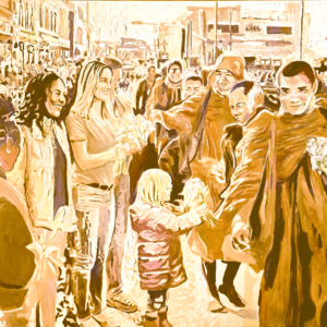
The Work of Peace | Monks’ Peace Walk- Edition in Cream Colors
Price range: $19.00 through $899.00 -

Season’s End | Canoe Racks at Sunset Lake – Edition in Cream Colors
Price range: $19.00 through $899.00 -

Columns in Time | Orton Plantation – Edition in Cream Colors
Price range: $19.00 through $899.00 -

The Weight of Time | Heck-Andrews House – Edition in Cream Colors
Price range: $19.00 through $899.00 -

Love Before Words | Zora at Liberty Acres – Edition in Cream Colors
Price range: $19.00 through $899.00 -

The Madness of Bloom | Tulips at Firefly Farm – Edition in Cream Colors
Price range: $19.00 through $899.00 -

The Architecture of Light | Duke Chapel – Edition in Cream Colors
Price range: $19.00 through $899.00 -

Marble Remembering Breath | Dancing Lesson at Biltmore – Edition in Cream Colors
Price range: $19.00 through $899.00 -

The Scent of Memory | Traveling Carnival – Edition in Cream Colors
Price range: $19.00 through $899.00 -

Waiting for Chloe | Chloe’s Carriage – Edition in Cream Colors
Price range: $19.00 through $899.00 -

What Horses Know | Secret at the Stable – Edition in Cream Colors
Price range: $19.00 through $899.00 -

Water Breaking into Light | Little Bradley Falls – Edition in Cream Colors
Price range: $19.00 through $899.00 -

The Roar of Light | Occoneechee Speedway – Edition in Cream Colors
Price range: $19.00 through $899.00 -

Grace Under Glass | Conservatory at Biltmore – Edition in Cream Colors
Price range: $19.00 through $899.00 -

Bound to the Light | Bodie Island Lighthouse – Edition in Cream Colors
Price range: $19.00 through $899.00 -

Whispers of the Creek | Creek at Leasburg – Edition in Cream Colors
Price range: $19.00 through $899.00 -

Dapppled Witness | Trellis at Biltmore – Edition in Cream Colors
Price range: $19.00 through $899.00 -

The Shape of Devotion | Pair of Black Swans at Liberty Acres – Edition in Brown
Price range: $19.00 through $899.00 -

The Long Memory of Water | Grand Canal in Venice – Edition in Cream Colors
Price range: $19.00 through $899.00 -

Memories of Salt and Time | Marshallberg Fishing Boats – Edition in Cream Colors
Price range: $19.00 through $899.00 -

Before the Fall | Magnolia Blossoms – Edition in Cream Colors
Price range: $19.00 through $899.00 -

Light in Circulation | Fountain Reflections – Edition in Cream Colors
Price range: $19.00 through $899.00 -

Unbridled Light | Red Mountain Hounds – Edition in Cream Colors
Price range: $19.00 through $899.00
Creamy Skies over the Piedmont: Haze, Heat, and Gentle Southern Luminosity
For a painter, this is a gift. Impressionism thrives not on sharp contrasts but on transition, on the way light dissolves form and invites the eye to wander. The Piedmont sky teaches this lesson daily. Trees melt into one another at the horizon. Distant barns soften into pale silhouettes. Reds and greens lose their insistence and lean toward harmony. Cream enters the landscape not as a color laid on top, but as a condition of seeing.
This is Southern luminosity—gentle, persistent, forgiving. Unlike the crystalline light of the mountains or the stark brilliance of the coast, Piedmont light wraps rather than cuts. It allows beige fields, tan clay roads, and weathered wood to glow from within. It is the light of long afternoons, of cicadas humming, of time stretching rather than snapping.
In this sky, cream becomes a mediator between earth and heaven. It holds heat without aggression and brightness without glare. It reflects a Southern sensibility rooted in patience and continuity. To paint it is not to chase spectacle, but to honor presence—to let light settle, breathe, and quietly become luminous.
Light Before Color: Cream as the First Breath of Creation
Before red burns, before blue deepens, before green rises from the ground, there is light—undivided, unnamed, and complete. Across spiritual traditions, light precedes color, and cream, in its gentlest form, becomes the human translation of that first illumination. It is light made touchable. Light slowed down enough to live with.
Creation myths begin not with pigment but with radiance: “Let there be light.” Not light as decoration, but light as existence itself. Cream holds this origin story within it. It is never loud, never demanding. Instead, it hovers between brilliance and silence, suggesting beginnings without insisting on conclusions.
In philosophy, light has long symbolized consciousness, goodness, and truth. Plato aligned the sun with the idea of the Good; sacred texts speak of illumination as salvation. Cream absorbs these meanings and grounds them. It becomes light that has passed through matter—through wool, stone, skin, and air. It is the color of first mornings, of fog lifting, of rooms just waking.
For painters, especially those working in an Impressionist lineage, cream is not absence but potential. It is the field upon which everything else may appear. Canvas itself often begins as a creamy ground, warming the surface so that subsequent colors breathe rather than sit stiffly. This underlight shapes the emotional temperature of the entire painting.
Cream reminds us that color is born from light, and meaning from stillness. It is the breath before speech, the pause before form. In a world of saturation and noise, cream returns us to origin—to the moment when seeing itself began.
From Raw Wool to Radiance: Beige and the Poetry of the Undyed World
Beige begins its life without intervention. It is the color of wool freshly shorn, untouched by bleach or dye, carrying within it the history of the animal, the pasture, the weather. This is color as truth rather than choice. The French word beige once meant exactly this—natural wool, unaltered, honest.
There is poetry in such restraint. Beige does not perform; it endures. It is the color of usefulness elevated to beauty, of materials allowed to speak in their own voice. In pre-industrial worlds, beige was everywhere—linen, canvas, rope, parchment—because it was what the earth offered without insistence. It carried warmth without ornament.
In art, beige grounds composition. It steadies the eye. It allows stronger colors to appear more fully themselves. Many painters, knowingly or not, rely on beige’s quiet labor to create balance and coherence. It is the unsung harmony beneath the melody.
In North Carolina landscapes, beige lives in harvested fields, clay paths, dried grasses, and winter woods. It appears when green recedes and the land exhales. This is not death but rest—a visual pause that restores equilibrium.
Beige teaches us that radiance does not require saturation. Light can emerge from modesty. There is dignity in the undyed, wisdom in the unadorned. To honor beige is to recognize the beauty of things as they are, before embellishment, before desire alters truth.
Ecru and the Sacred Ordinary: Unbleached Cloth, Humble Light, Holy Ground
Ecru, meaning “raw” or “unbleached,” belongs to the realm of the sacred ordinary. It is the color of monk’s robes, altar cloths, and manuscripts—materials chosen not to dazzle but to disappear into purpose. Ecru does not draw attention to itself; it makes space for meaning.
Historically, unbleached cloth was practical and available, but it also became symbolic. In religious contexts, its simplicity echoed humility, purity, and devotion. Light touching ecru does not bounce—it settles. It rests. This is light that invites contemplation rather than awe.
In painting, ecru grounds and softens. It holds warmth without color bias, allowing the artist to build gently, thoughtfully. Many Impressionist painters favored such grounds because they reflected light back through thin layers of paint, creating a glow that felt internal rather than applied.
Ecru mirrors the spiritual idea that holiness lives in the everyday. Fields, kitchens, studios, and hands become sanctuaries when seen with care. In Southern spaces—linen curtains stirring in heat, cotton sacks, farmhouse walls—ecru carries memory and labor, both dignified and human.
This color teaches reverence without hierarchy. It reminds us that the sacred is not elsewhere. It is here, in unbleached light, in humble materials, in quiet ground that waits patiently to receive meaning.
Illuminated Calm: Cream Tones and the Quiet Language of the Soul
Cream speaks softly, but it speaks deeply. Psychologically, it calms without dulling, comforts without enclosing. It is the color of safety—of rooms where the nervous system can finally rest. Unlike stark white, cream carries warmth; unlike darker neutrals, it does not weigh down the spirit.
This is why cream appears again and again in spaces of healing: bedrooms, studios, chapels, and galleries. It reduces visual noise, allowing breath and thought to slow. The eye does not stop abruptly on cream—it glides. That movement mirrors inner ease.
In art, cream creates emotional openness. It allows figures and landscapes to exist without tension. Impressionist painters understood this intuitively, using creams to unify light and dissolve harsh boundaries. The result is not emptiness, but coherence—a visual equivalent of harmony.
Cream also mirrors the soul’s quieter emotions: peace, acceptance, endurance. It is not the thrill of passion, but the depth of belonging. It is the color of staying rather than striving.
In a fast, saturated world, cream offers refuge. It reminds us that stillness is not absence, and softness is not weakness. Sometimes the most profound illumination arrives gently—without spectacle—settling into us like light at the end of a long day.
Buff and Bone: Mortality, Memory, and the Soft Color of Time
Buff is the color of what remains. It is the pale yellow-brown of weathered bone, old paper, dried leather, and sun-worn stone. Unlike stark white, which suggests purity or transcendence, buff belongs to the passage of time. It is a color shaped by erosion rather than invention. In it, mortality does not shock—it settles.
Across cultures, bone has served as both reminder and relic. From ancestral tools to sacred ossuaries, bone carries memory forward. Buff, as bone’s visual echo, inherits this role. It is the hue of archives and attics, of manuscripts touched by many hands, of walls that have absorbed generations of light. It holds history quietly, without spectacle.
In painting, buff functions as a stabilizer. It tempers brighter tones, grounding composition in human scale. Impressionist painters often relied on buff and related earth neutrals to soften transitions between light and shadow, allowing scenes to feel lived-in rather than staged. Light interacting with buff does not glare; it glows faintly, like remembrance itself.
In the American South, buff appears in tobacco barns, dried grasses, shell fragments, and unpainted wood bleached by sun. In North Carolina landscapes, it often emerges in winter—when color recedes and form reveals its skeleton. Fields flatten, trees bare themselves, and land becomes contemplative.
Buff teaches us that time does not erase meaning; it refines it. Memory does not shout—it lingers. This color is not about loss alone, but about continuity. It is the soft shade of endurance, the visual language of everything that has been and quietly remains.
Sand, Linen, and Silence: Desert Neutrals and the Spiritual Weight of Stillness
Sand is matter reduced to patience. Grain by grain, it records wind, water, and time. Its color—somewhere between cream, beige, and pale gold—belongs to landscapes shaped by restraint. Deserts speak through stillness, and their neutrals carry spiritual gravity.
In religious history, deserts are places of revelation. Prophets, mystics, and seekers entered emptiness to encounter truth stripped of ornament. The palette of sand and linen mirrors this discipline. These colors refuse distraction. They quiet the eye so the mind may listen.
Linen, unbleached and raw, carries the same ethic. Woven from flax, it bears the mark of human labor without indulgence. Linen’s pale warmth absorbs light rather than reflecting it, creating a visual hush. Together, sand and linen form a language of humility—materials that neither dominate nor disappear.
In painting, desert neutrals establish emotional stillness. They provide spaciousness, allowing light to function as presence rather than effect. Many painters have used such tones to suggest contemplation, timelessness, or spiritual pause. The viewer is invited not to consume the image, but to dwell within it.
Though North Carolina is lush rather than arid, moments of desert quiet appear here too—coastal dunes at dawn, winter fields, long stretches of pale earth beneath a wide sky. In these places, color recedes and silence becomes visible.
Sand and linen remind us that meaning often arises where noise ends. Their beauty lies not in variety, but in continuity. They teach us to slow, to stand still, and to recognize that light alone can be enough.
Tuscan Light and Southern Clay: Old World Creams Meet North Carolina Earth
Tuscan light is famous for its generosity. It warms stone, lifts dust, and turns walls into glowing planes of ochre, cream, and pale gold. This light does not isolate objects—it binds them. Architecture, land, and sky share a common tone, unified by sun and age.
When this Old World palette meets Southern clay, the conversation feels natural. North Carolina’s red and tan soils, when softened by distance or haze, shift toward creamy earth tones that echo Mediterranean hillsides. Despite geography, the materials speak the same language: mineral, sun, and time.
For painters, this kinship is profound. Creams derived from clay and stone create continuity between foreground and horizon. They allow buildings and landscapes to feel rooted rather than imposed. Impressionist sensibilities thrive here, where light unifies rather than divides.
Tuscan cream carries history—layers of limewash, dust, and hand-mixed pigment. Southern clay carries labor—fields worked, bricks fired, roads worn. Together, they represent civilizations shaped by land rather than resisting it.
In North Carolina, old farmhouses, tobacco barns, and mill walls often wear this meeting of worlds. Their surfaces glow softly at dusk, neither red nor white, but something in between—earth made luminous by memory.
This shared palette reminds us that place is not only geography, but material response to light. When Old World creams meet Southern earth, the result is timeless—a color shaped not by fashion, but by belonging.
Khaki, Canvas, and the Human Hand: Labor, Landscape, and Useful Beauty
Khaki is the color of work. Born from earth and necessity, it carries the dust of roads, the creases of uniforms, the stains of use. Unlike decorative neutrals, khaki announces function. It is beauty shaped by purpose.
Originally developed for camouflage and endurance, khaki found its way into civilian life because it worked. It resisted dirt, weathered gracefully, and belonged equally to field and studio. Its appeal lies in honesty—nothing is hidden, nothing exaggerated.
Canvas shares this ethic. Unprimed, unbleached, it holds the raw warmth of woven fiber. Painters know this surface intimately. It absorbs paint differently, allowing light to pass through layers rather than sit on top. Khaki and canvas together form the backbone of many artworks, quietly supporting expression.
In landscapes shaped by labor—fields, rail lines, docks—khaki appears naturally. In North Carolina, agricultural paths, work clothes, and weathered structures carry this hue as a badge of continuity. It is the color of effort sustained over time.
Khaki teaches us that usefulness is not the enemy of beauty. There is dignity in things made to last. When light touches khaki, it does not sparkle—it steadies. It affirms the human hand, the act of making, and the quiet nobility of work done well.
Tan as Shelter: Hearth, Home, and the Architecture of Comfort
Tan is the color of welcome. It belongs to walls warmed by firelight, to floors worn smooth by footsteps, to spaces designed for gathering rather than display. Architecturally, tan functions as embrace rather than statement.
Derived from earth and wood, tan carries the psychology of shelter. It stabilizes, reassures, and grounds. Unlike cooler neutrals, it radiates warmth without dominance. This is why tan has long been favored in homes meant to endure rather than impress.
In interior spaces, tan absorbs light gently, creating continuity from morning to evening. It holds shadows softly, allowing rooms to feel alive even in stillness. In painting, tan grounds composition, providing a base that supports both color and emotion.
Throughout history, hearth-centered cultures have gravitated toward tan and related earth tones. These colors echo clay, ash, grain, and stone—materials tied to survival and family. In Southern homes, tan appears in brick, pine, plaster, and soil tracked indoors. It becomes part of daily life.
Tan teaches us that comfort is architectural, emotional, and visual. It is not indulgence, but care. In a world increasingly abstracted, tan returns us to the body, the home, and the simple human need to feel held.
Impressionist Neutrals: How Beige Carries Light Without Shouting
Beige is light that has learned restraint. In Impressionist painting, it became a quiet carrier of atmosphere—never declaring itself, yet holding entire scenes together. While brighter pigments captured attention, beige and its kin worked underneath, modulating glare, softening transitions, and allowing light to breathe across the surface of the canvas.
Impressionist painters understood that light is not always white. It arrives filtered—through dust, moisture, air, and time. Beige absorbs these conditions gracefully. It does not compete with color but supports it, allowing blues to cool and greens to rest. Claude Monet often relied on warm neutrals beneath his visible strokes, creating a luminosity that feels lived-in rather than theatrical.
Unlike stark whites, beige holds shadow without collapsing into darkness. It accepts fluctuation. Morning and evening light pass through it differently, giving form a sense of duration. This quality made beige invaluable for outdoor painting, where light shifts constantly and certainty dissolves.
Beige’s power lies in understatement. It refuses drama and instead offers continuity. In Impressionism, this neutrality was radical—it allowed sensation to replace symbolism and perception to replace hierarchy. Beige became the color of seeing honestly.
In this way, beige does not shout because it does not need to. It carries light the way air carries sound—present, essential, and often unnoticed until it is gone.
The Wool Color of Humanity: Skin, Stone, and Shared Warmth
Beige begins in the body. It echoes skin warmed by sun, wool shorn from sheep, stone softened by weather. Long before it was named, this color existed as a common denominator—linking human flesh to the material world.
The French origin of the word beige, meaning undyed wool, speaks to this intimacy. Wool is shelter, labor, and care. Its natural hue carries warmth without ornament, suggesting usefulness before beauty. That same warmth appears in skin tones across cultures, not as sameness but as shared ground.
Stone, too, participates in this spectrum. Limestone, sandstone, and worn marble settle into pale beiges over time, absorbing light rather than reflecting it sharply. These surfaces feel human because they age as we do—gradually, visibly, without disguise.
Artists have long used beige to unify figures and environments. It allows bodies to belong to their settings instead of standing apart from them. Flesh painted against beige does not perform; it exists. This color makes room for dignity without spectacle.
Beige reminds us that humanity is not defined by extremes but by continuities. It is the color of common ground—between skin and earth, labor and rest, individuality and belonging. In a world drawn to contrast, beige offers connection.
Apple Pie Crust and Café au Lait: Domestic Rituals in Soft Browns and Creams
Some colors live not in galleries but in kitchens. Apple pie crust, café au lait, toasted bread—these are not decorative hues but ritual ones. Their soft browns and creams mark time measured in meals, seasons, and shared tables.
Apple pie crust carries the color of transformation: flour to dough, dough to warmth. It is beige deepened by heat, history, and care. Café au lait blends darkness and light into balance, mirroring the daily ritual of pause and gathering. These tones comfort because they are familiar, not because they are neutral.
In domestic interiors, such colors slow the eye. They invite staying. Walls painted cream or tan hold light gently, allowing conversation and movement to take precedence. These hues do not impress; they sustain.
Painters have often borrowed from this domestic palette to ground their work emotionally. Soft browns and creams stabilize composition, making space feel inhabited rather than staged. They recall tables, floors, and hands rather than ideals.
These colors teach us that beauty can be habitual. Repetition does not dull meaning; it deepens it. Apple pie crust and café au lait are not symbols of luxury but of continuity—rituals repeated until they become anchors.
In their warmth, we recognize care made visible. These are colors that feed as much as they show.
From Monastery to Studio: Linen Grounds and the Birth of Modern Painting
Before paint, there was cloth. Linen—raw, unbleached, and quietly luminous—formed the foundation of painting long before modernity named itself. In monasteries, linen carried sacred images meant to endure. Its pale warmth suggested humility and light at once.
This unassuming ground shaped vision. Linen absorbed pigment differently than wood or plaster, allowing color to sink rather than sit. Light passed through layers, creating depth without gloss. When painting moved from sacred spaces into studios, linen followed, bringing its discipline with it.
The shift toward modern painting did not abandon tradition—it refined it. Artists embraced linen’s neutrality as freedom. Its cream tone allowed color relationships to emerge organically, without dominance. It neither demanded symbolism nor erased it.
In Impressionist practice, linen grounds supported rapid perception. They allowed the painter to respond to light as event rather than doctrine. The surface itself became collaborator, holding warmth beneath fleeting strokes.
Linen stands between devotion and experimentation. It is the quiet witness to change. From monastery walls to open-air studios, its pale surface carried both reverence and risk. Modern painting was born not on white emptiness, but on this humble, breathing ground.
Coastal Sands of North Carolina: Wind, Water, and the Color of Arrival
Along the North Carolina coast, sand is never still. Wind lifts it, water reshapes it, light alters it hour by hour. Its color—cream, buff, pale tan—records motion rather than permanence. These sands are the color of arrival, where land meets uncertainty.
Unlike dramatic cliffs or dark soil, coastal sand reflects rather than absorbs. It softens horizons and extends light upward into the sky. Painters drawn to this edge of the state often notice how color dissolves here—how distinctions blur into atmosphere.
North Carolina’s barrier islands wear time lightly. Sand shifts but remains. Its neutrality allows sea, sky, and human presence to coexist without hierarchy. Footprints appear briefly, then vanish. The land teaches impermanence without erasure.
This palette invites contemplation. Creamy sands do not demand interpretation; they offer space. In art, such tones create breathing room—areas where the eye rests and the mind opens. They carry memory without insisting on it.
Here, beige is not background but condition. It is shaped by tide and sun, by departure and return. Coastal sand reminds us that color can be a meeting place—between motion and stillness, between holding and letting go.
Cosmic Latte and Infinite Quiet: Beige as the Average Color of the Universe
In the early 2000s, astronomers determined that the average color of the universe is not black, nor blue, nor gold—but a soft, milky beige they named Cosmic Latte. This revelation feels quietly profound. The universe, when all its blazing stars and deep voids are averaged together, resolves into something gentle, creamy, and calm.
Beige here becomes cosmic reconciliation. It is what remains when extremes cancel one another out—light and darkness, heat and cold, violence and stillness. Rather than drama, the universe offers balance. Beige is not emptiness; it is fullness held in equilibrium.
This idea echoes ancient philosophies that associated light with being itself. Beige, as softened light, suggests existence without urgency. It is illumination that has learned patience. Unlike white, which can feel absolute, beige allows uncertainty and warmth to coexist.
In art, this cosmic neutrality mirrors the way painters use beige to unify compositions. It absorbs difference without erasing it. Figures, landscapes, and skies can all belong within its range.
Cosmic Latte reframes beige as expansive rather than timid. It is the color of infinite quiet—the hush beneath all sound. When we sit with beige, we are not withdrawing from meaning; we are entering its most spacious form.
Light French Beige: Elegance, Restraint, and the Art of Subtlety
Light French Beige carries the cultural memory of restraint refined into beauty. Rooted in French decorative tradition, it reflects an understanding that elegance does not require excess. It lives in plaster walls, linen garments, stone facades—places where light is allowed to settle rather than perform.
This shade does not demand attention. Instead, it rewards attention. Its warmth is calibrated, its brightness moderated. In this way, Light French Beige mirrors the classical ideal of harmony—nothing too much, nothing too little.
Artists have long relied on such tones to create depth without spectacle. In painting, this beige supports form gently, allowing shadow and highlight to converse rather than compete. It holds atmosphere like breath held calmly in the chest.
Light French Beige also embodies cultural confidence. It suggests a comfort with understatement, a trust that meaning will emerge without being forced. This sensibility influenced modern painting, where suggestion replaced declaration and nuance became power.
As a color, it teaches discernment. It reminds us that subtlety is not absence but discipline. Light French Beige is elegance that whispers—and in doing so, endures.
Impressionism’s Soft Backbone: Neutrals Beneath the Color Storm
Impressionism is often remembered for its brilliance—violets, blues, greens, and golds vibrating across the canvas. Yet beneath this color storm lies a quieter structure: neutrals. Beige, cream, and soft tans form the backbone that allows light to shimmer without collapsing into chaos.
These tones anchor sensation. They provide intervals of rest where the eye can pause, recalibrate, and continue. Without them, color would overwhelm. With them, color sings.
Impressionist painters understood that light is relational. It needs contrast, absorption, and reflection. Neutrals absorb excess and release warmth slowly. Beige, in particular, mediates between temperatures, allowing cool shadows and warm highlights to coexist naturally.
Often laid in early, these tones establish atmosphere before detail. They are the ground from which immediacy emerges. Even when partially hidden by later strokes, they continue to influence the painting’s internal weather.
Calling neutrals passive misses their quiet authority. They do not dominate, but they decide. They determine mood, scale, and coherence. In Impressionism, beige is not background—it is structure made gentle.
Beige as Sanctuary: Healing Spaces, Bedrooms, and the Psychology of Ease
Beige is the color of refuge. Psychologically, it signals safety without confinement, neutrality without emptiness. In healing spaces—bedrooms, retreats, quiet rooms—beige creates an environment where the nervous system can soften.
Unlike stark white, which can feel clinical, beige carries warmth. Unlike darker hues, it does not press inward. It holds space rather than shaping it aggressively. This makes it ideal for restoration, where the goal is not stimulation but repair.
Studies of color psychology consistently associate beige and soft creams with calm, reliability, and comfort. These tones echo natural shelters—sand, wool, wood, stone—materials humanity has trusted for millennia. Beige reminds the body of survival without threat.
In interiors, beige recedes just enough to let life take center stage. Light moves freely across it. Shadows feel gentle. Objects feel grounded. The room becomes a container for rest rather than performance.
As sanctuary, beige does not distract from healing—it supports it. It is the color of permission: permission to slow down, to exhale, to be unfinished. In this way, beige becomes not merely a design choice, but an act of care.
Where Light Comes to Rest: Cream, Calm, and the Grace of the In-Between
Cream is light at rest. It exists between brilliance and shadow, between arrival and departure. Where white dazzles and color asserts, cream listens. It is the pause that gives rhythm meaning.
This in-between quality gives cream its spiritual weight. Across cultures, soft light has symbolized grace—not revelation, but presence. Cream does not announce truth; it allows truth to settle.
In painting, cream creates continuity. It smooths transitions, softens edges, and holds space for ambiguity. It is especially powerful in moments of stillness—early morning, late afternoon, interior silence. These are times when light feels intimate rather than infinite.
Cream also reflects human temporality. It is the color of aging paper, worn cloth, sunlit bone. It carries time gently, without nostalgia or decay. Its calm is earned, not imposed.
Where light comes to rest, meaning often gathers. Cream teaches that fulfillment does not always appear as climax. Sometimes it arrives as balance, quiet, and grace sustained.
In the language of color, cream is not the end of the story—it is the place where the story finally feels at home.